Content
As the market for specialized software gets more crowded, there’s a growing demand for unique and well-designed products. This push for improved design quality has boosted the UI/UX design services. According to forecasts by analysts at Fortune Business Insights, the industry’s value will exceed $32.95 billion by 2030. This boom is mostly because companies are looking for systems that work well and are easy to use. Because good UI/UX accelerates processes and improves how well a team works.
Today, you will learn more about how to create truly effective product designs for automating your business and how to objectively evaluate them.
General Requirements for Business Automation Platform Design
Analysts at Statista anticipate that by 2028, the total value of enterprise software will exceed $376 billion. As companies are increasingly investing in the development of their own tools, quality design works as the backbone for effective corporate digital products.
And here’s what backs up this idea. Experts at Business Research Insights believe that the value of the UI design sector will reach $6.383 billion by 2031.
All these numbers tell us one thing. The way digital products look is important. Maybe not the be-all and end-all, but definitely crucial for their success. Plus, a good UI/UX can make a big difference in how efficiently staff can work with corporate systems.
Looking back at our experience and case studies from other development studios, we’ve pinpointed three key things that clients want from specialized platforms in terms of design.
Ease of Use
Business representatives have their own understanding of quality for design. To them, it means that even someone who’s never seen the system before should be able to use it confidently after just a week of intensive training.
This implies that the graphical component (animations or images on screen backgrounds), don’t really matter for business software. On the contrary, the simpler the design, the easier it is for users to get down to work.
Navigation Logic
Imagine a CRM packed with an incredible number of control elements on the dashboard, constantly sending the user to secondary screens. Or even worse, when you click on a client’s name, you’re bombarded with options you don’t need in the middle of trying to solve a problem or have a chat.
This is a classic case of navigation gone wrong, and it’s a big part of the product’s UI/UX. When this happens, employees end up spending significantly more time to get things done, which can really drag down ROI and leave customers unhappy.
Focus
Every design element must make sense visually. For example, you may want to split the screen in two: where one side shows information, and the other has all the buttons and menus you can interact with.
The proportions between the two parts should be just right, so you can naturally focus on the useful information and find what you need intuitively. In other words, proper prioritization of design elements is important.
It allows employees to quickly perform tasks without a fuss using the company’s tools.
What Should Be the Focus When Creating UI/UX for Business Automation Platforms?
One of the top 20 reasons for startup failures is “Poor Product,” which usually includes weak design.
So, when you develop a business automation platform, you should think about more than its direct functionality. On top of that, you’ve got to consider how user-friendly it will be. And it is precisely what the design, namely UI/UX, solves.
Here’s what you should focus on when developing a layout in web design for your corporate system.
Simplicity of Design
Material Design combined with popular screen layout practices is the optimal blend for styling the visual elements of your corporate digital product.
Such a design will be quite concise but visually pleasing and easy to use. As a result, it’ll make training staff on new systems quicker and boost their productivity too.
Focus Points
Quality evaluation in design process should be based on how effectively operational elements capture the user’s attention and how quickly they find and activate important control elements.
If you develop the product for corporate purposes, it should contain a contrasting visual that focuses professionals on key functions, information fields, and data.
Otherwise, users will be distracted by secondary elements that do not have significant value for the successful completion of the task.
Productivity and System Stability
No matter how attractive the design, the smallest productivity issues will negate all existing advantages. By the way, this is one of the key design quality metrics experienced developers use.
Every visual element uses up some resources, which really matters if a company’s working with basic “office” computers. Conditional Server-Side Rendering may partially mitigate productivity issues, but it is better to address them at the design modeling stage.
Integration with External Modules
Corporate software is often a complex combination of various tools united in a common dashboard. This means that CRM, ERP, messaging, business analysis tools, and others may coexist in one system.
The designer’s task is to organically combine the GUI of all modules or their parts on operational screens by calling API for certain components.
Adaptability of GUI
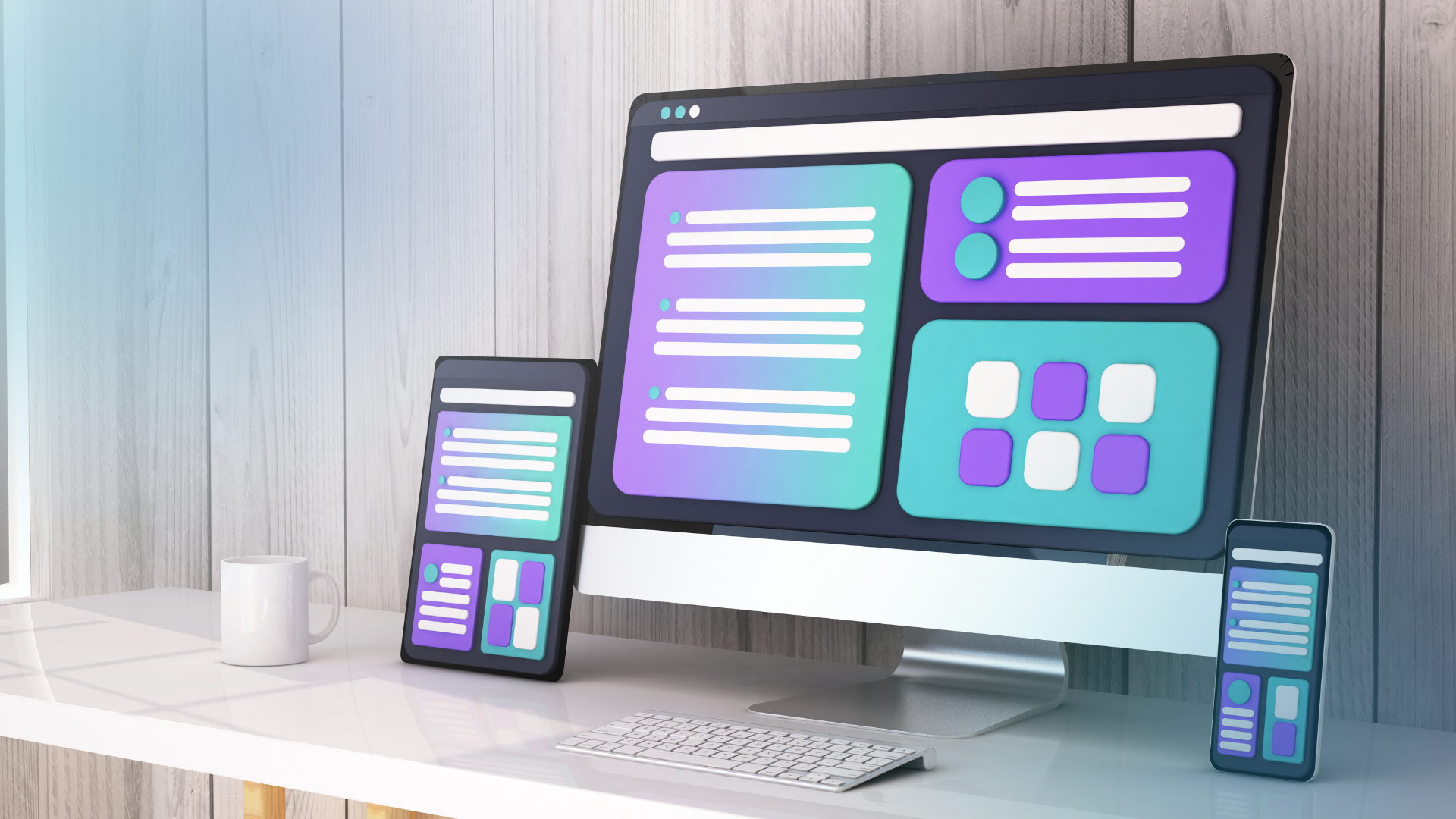
Modern corporate tools are cross-platform solutions. This means they offer the same functionality across various devices—from desktops and laptops to tablets and smartphones.
So, the design of your product has to be able to adjust to different screen sizes and formats. It is important to maintain operational capabilities and quick access to critical functions. While the task may not be simple, it is entirely achievable.
How to Determine Layout Quality through Prototyping?
Design quality is determined by how convenient and pleasant your digital product is for the people who are going to use it. For corporate tools, this means for the company’s employees.
The most important indicator of design quality is feedback from real users. Only this assessment is objective and demonstrates whether you hit the mark or completely missed it.
Testing with Real Users
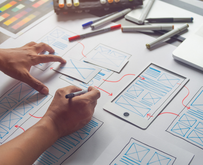
Conduct the initial checks on interactive prototypes. This enables users to conduct direct testing without involving sensitive data long before a full-scale product is developed.
For instance, you can set up a remote session where a few employees get to play around with the product’s interface. They can click through screens, explore menus, and see how everything feels.
After testing, collect feedback and suggestions that will help you optimize the design.
Adherence to Key Design Principles
There are basic principles of design creation that focus on visual and logical components, layout division rules, workspace organization, and so on.
Even if you want to implement a “unique” element or have your own idea of the perfect layout, in most cases, it would be smarter to stick to practices tested by time. They are backed by analytics and testing, so the chances that your staff will enjoy the layouts created based on proven practices are pretty high.
Intuitive Perception
Last but not least. The design should be so easy to navigate that even an inexperienced employee could quickly learn how to use the corporate product.
This means that the system design should be intuitively understandable, optimized, and contrastive in terms of interactive and informational elements of the GUI.


